
Context: This post was written during the depths of the COVID-induced market panic.
When do we buy? When do we sell? When do we hold? When do we run away? #
Here at Didact AI, we built a simple model to identify points in time when the markets are back in a state of calm. We believe this has immense value for folks who are uncertain about whether to hold their equity positions, buy more, or sell everything and hide in the Canadian Rockies.
Market commentators often split equity market behavior into “bull” and “bear” regimes. Bull regimes are when it’s nice and sunny, and equity indices are rising, companies are profitable, people are gainfully employed, and/or the fiscal position of the government is strong.
In contrast, bear regimes are when equity indices are falling or are at multi-year lows, companies are making losses, unemployment rates are reaching new highs, and/or the federal government is fiscally out of options.
Notice that regardless of the type of regime, they each portray the economy through multiple, potentially uncorrelated, macroeconomic and financial lenses: company profitability, equity index performance, employment rates, and the fiscal stance of the federal government.
Because there are so many factors to think about, and because the talking heads on CNBC and Bloomberg cannot seem to agree on anything, it’s tempting to simply call plunging markets ‘bear’ markets and rising markets as ‘bull’ markets.
This simple model however considerably misses the mark in helping us decide when to buy and when to sell.
For instance, is today (March 17th 2020) a good time to buy? Or sell? If you buy, how do you know the markets won’t fall further? If you sell, how do you know the markets won’t jump upwards in reaction to an announcement by the current administration or by the Federal Reserve?
You don’t know. You can’t know, because the model above lacks the information you want it to capture: information about the panic that’s happened over the last few days, and information about whether market participants anticipate calm or volatile markets in the future.
Modeling market regimes: a simple approach #
Starting from basics, at any given point in time, we need to know where we are coming from (panicked markets or calm markets), and where we are potentially headed (market expectations of volatility).
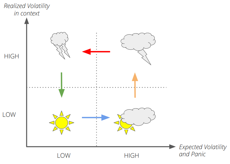
We can roughly decompose the state of the markets into four distinct states (or regimes):
- CALM: Low realized volatility, low expected volatility going forward. Markets are humming along merrily.
- CLOUDY: Low realized volatility, high expected volatility (something might happen soon!). Aggregate market expectations indicate a storm on the horizon — could be anything from pandemics to bilateral trade wars.
- STORMY: High realized volatility, high expected volatility. Stocks are flying about, markets are crashing, general mayhem everywhere you look. If we were CNBC talking heads, we would say “markets seem to be directionally bound to the downside”, and we would appear intelligent, famous (and handsome).
- CHOPPY: High realized volatility, low expected volatility. Markets are pausing for breath — they may trade sideways for a while, or go back to the center of the storm, or they might calm down further. Market action will be difficult — large up moves closely following large down moves, and vice versa.
Here’s an illustration of the regimes:
This is all well and good, but a few questions still remain:
- How do we measure expected volatility? How do we know if it’s “high” or “low”? How do we measure “panic”?
- How do we measure realized volatility? (Hint: not by standard deviations of close-to-close returns.)
- How do we place realized volatility in context? How do we know if it’s “high” or “low”?
- What are the chances that a CHOPPY market might go back to being STORMY, or turning CALM?
Modeling market regimes: the details #
Let’s tackle these questions one by one.
Measuring expected volatility: Traditionally, the VIX Index has been a reliable barometer of expected market volatility, over the next 30 days. However, it is an imperfect market timing indicator, since it can stay high (or continue going higher) with uncertain mean reversion; even when it goes down again, the markets might not bounce back commensurately. Regardless, we measure VIX at close every day to get an estimate of current expectations of volatility over the next few days. We know if it’s high or low by comparing it to what it was 5 days ago (a week ago). This period is small enough to be able to capture sudden changes in market dynamics, but long enough to not get swayed by freak events such as flash crashes.
A proxy for panic: We use CBOE’s VVIX Index, which measures the expected volatility of the VIX, as a reasonable proxy for market panic. As panic rises in the markets, there will be increasing uncertainty around how volatile the next few days are going to be, and this is captured really well by VVIX.
Summarizing volatility expectations: We measure VVIX:VIX, i.e. how much panic is currently expected per unit of uncertainty. We contextualize this by comparing it to its level 5 days ago (a week ago), as explained previously.
Measuring realized volatility: Traditionally, volatility has been measured by using the standard deviation of close-to-close daily returns. Unfortunately, it misses critical information such as the underlying symbol making new highs or plumbing new lows intraday. Why is this important? During bad days in the markets, we are all glued to the screen, mentally calculating our potential losses when stocks plumb new depths during trading hours. Since this affects our economic outlook, it should be captured in our model.
Futures traders, who live and die by their intraday margins, use a great proxy for volatility called Average True Range that accounts for intraday lows and highs. We use a slightly more sophisticated version of this concept, called a range-based volatility estimator (specifically Yang-Zhang), presented here in all its glory:
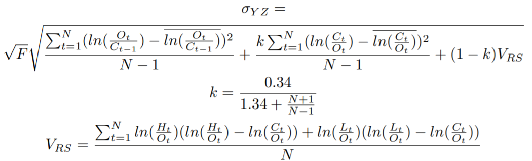
(It’s actually fairly straightforward to code up. The variable F can be used to scale from one time period to another.)
Just like for expected volatility, we compare the realized volatility against recent market history to place it in context.
Some Markov Chain magic #
Now that we have the basic dimensions of our analysis ready, what do we do next?
This is a great time to sneak in a finite Markov Chain. A Markov Chain is a fine piece of mathematical machinery that lets us model real-world systems as abstract machines that undergo transitions from one state to another, out of a finite number of states. It’s not really more complicated than that. As you can see, this is ideal from our perspective, since we want to keep the modeling to a minimum.
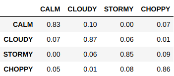
We fit our Markov chain specification (4 states — Calm, Cloudy, Stormy, and Choppy) on daily S&P 500 data from January 2007 to December 2019, which gives us a lucky 13 years’ worth of daily data to work with, and obtain a state transition matrix.
What’s a transition matrix? It’s a table that tells you what the probability is of moving from one state to another (we mean market states, not Connecticut to Hawai’i, although the probability of the latter happening is pretty high as of right now).
In any case, here’s our transition matrix, fresh from the forge of Pandas and Python:
And this is how our fitted Markov Chain looks like:
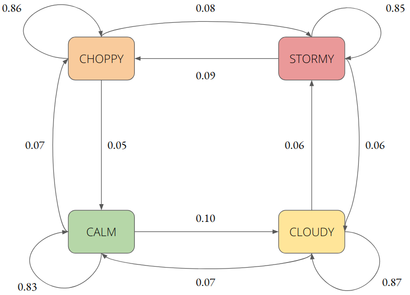
To read this, understand that if markets are CHOPPY, there’s a 86% chance they will remain CHOPPY, an 8% chance they will become STORMY, and a 5% chance that they will CALM down.
(Notice that the state transition probabilities for some states don’t seem to add up to 1.0, as they should. This is a rounding error: if the probability is very close to 0.0, we simply leave it out of the diagram.)
Which regime are we in now? #
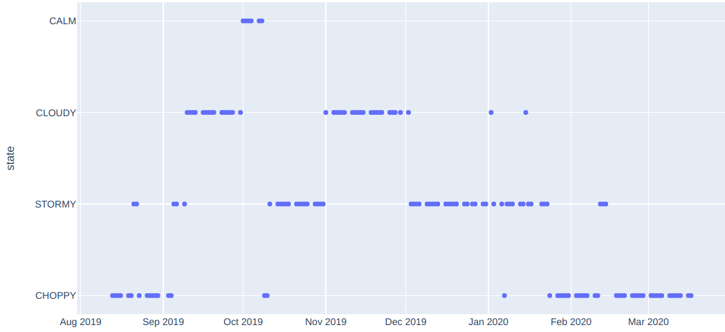
Starting on December 3rd 2019, our market regime model has been indicating higher risk, by continuing to stay in either STORMY or CHOPPY territory, with some tiny feints towards CLOUDY territory. Also note that the regime has been almost uniformly CHOPPY since the 3rd week of February this year.
How do market regimes differ? #
It’s great that we can identify which market regime we are in, as per our simple model above. But so what? What information does that give us?
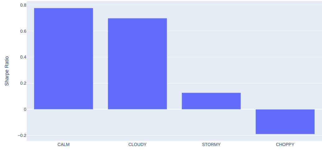
To answer that question, we computed annualized Sharpe Ratios of 5-day forward market moves, split by market regime. Here’s how it looks:
In tabular form, here’s how the 5-day forward Sharpes look:
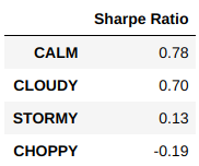
In short, it’s a terrible idea to buy into the market when it’s in a CHOPPY state; far better to wait until the market transitions to a CALM state.
Research has shown that timing plays a critical but underappreciated role in making money in the financial markets. You should be using all the tools at your disposal — that includes both neutral third-party analysis as well as frenzied sweaty CNBC talking heads shouting at each other.
In conclusion.. #
We demonstrated how we built our simple market regime model. There are ways of making this more complicated of course (in fact, one of us at Didact AI has a pending US patent on building complicated market regime models). We could account for moves across multiple markets, bringing in point-in-time macroeconomic data, add additional layers of historical context, and so on.
However, for the purposes of staying safe, it is sufficient to:
Look outside. Is it raining? If yes, wait until the skies clear.